
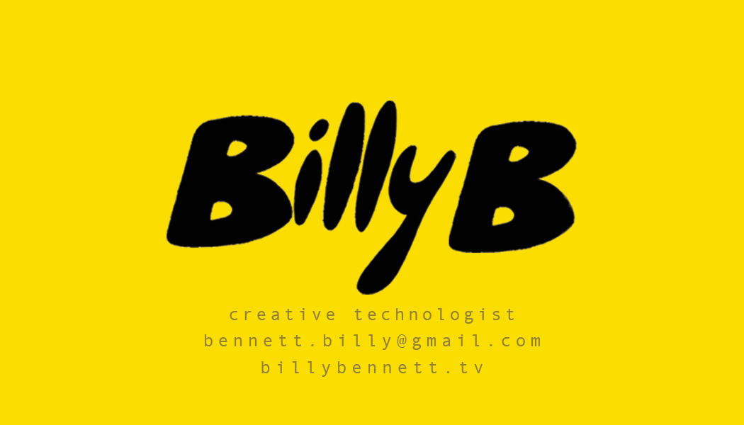

Well, you can’t choose your name, so if you have one that people like to say, go with it. The Billy logo was originally designed in conjunction with my great designer friend Ric Alessio // Deathspan. I wanted a logo that was fun, joyful, and playful.
For the business card, I wanted a simple design with memorable and impactful visuals. The yellow is not normally something I am drawn to, but I thought about all the business cards that I have taken over the years and what they look like on my bedside table. So the yellow with the bold black letters sticks out quite clearly in that scenario. Here are some early works from Ric.
I also went through a few different colors, almost going with Tiffany blue right away. My friend Parker said I should do Billy B instead of Billy and I fully agree with him in retrospect.
For the back of the card, I used a p5 javascript sketch to show some of my skill set. The colors did not come through however on the printing.


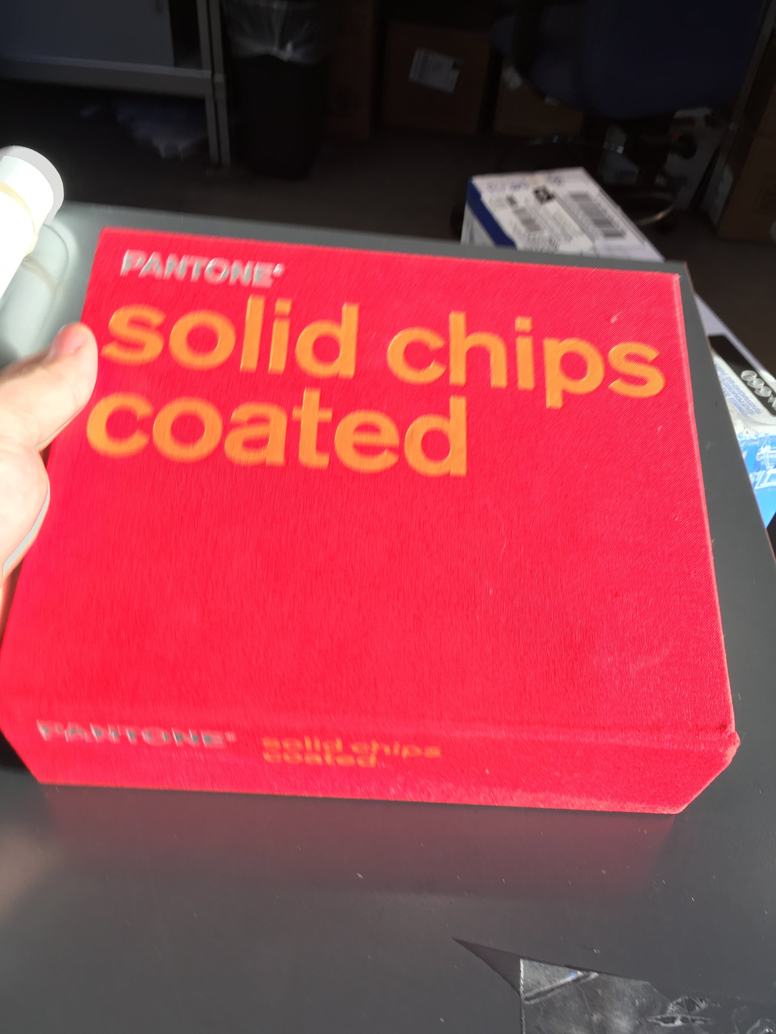
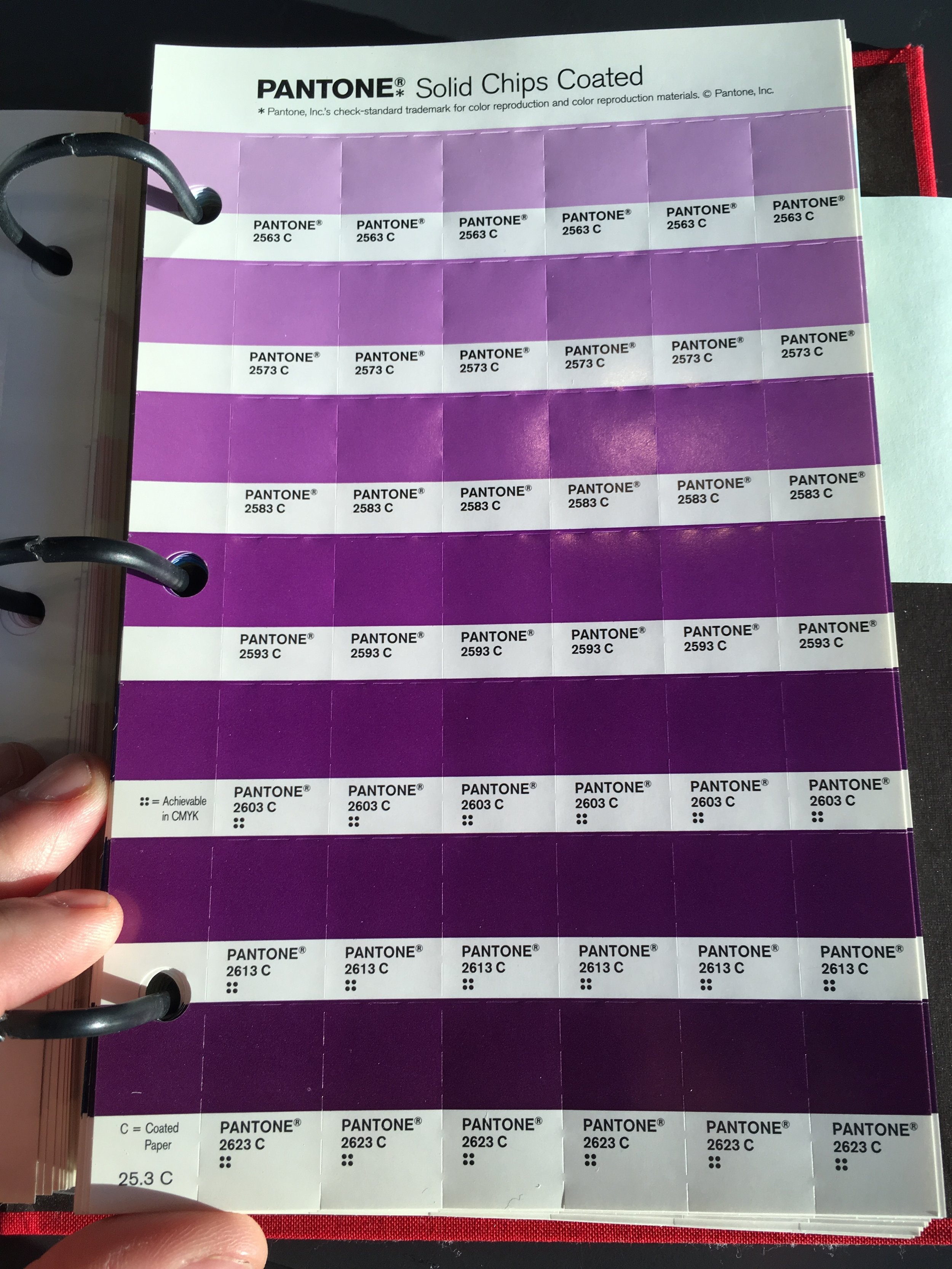
To get the colors right for the front, I went to the printers and looked through the Pantone chips.


