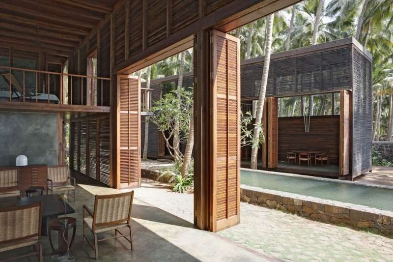
I am inspired by warm tones - sage and dark greens, warm browns, dark blues with light pink, pastel yellow and blue overtones. I relate to architecture and space when choosing colors. That is what I am mostly thinking of lately in terms of color. The feeling of an actual space and texture. In a lot of these photos, the colors feed into the feeling of the space, along with the content and arrangement of the physical elements. They evoke a sense of calm and order that is not oppressive, but affirming to me. You can see the faded pink in Brooklyn’s brownstones. I also like the darkened copper drain pipes on a weathered cathedral.
Here are some photos of my own that relate my color palette. Some are from the North Georgia mountains a few years ago. Others are from the Nashville Fairgrounds.
Leaves of the Mountain Laurel - my favorite tree. North Georgia, 2016.
North Georgia, 2016.
North Georgia, 2016.
The infamous Drake Hotel in Nashville, 2016.
This lovely gentleman let me take his picture. Nashville Fairgrounds, 2016.
In my room. Nashville, 2016.
In picking my palette, I couldn’t really get the brown and red right because it’s more of a temperature. The yellow is more light itself. The green and blue are all texture, how the light hits off the plants, and how the blue is feathered by the clouds.
I used this color palette on a p5 sketch I did for ICM. It’s entitled Donut Maker. You can see it cycle through deep green, sky blue, pale yellow, and pink and brown as the colors fade back into the background. The fact that some of the elements are somewhat opaque helps with the deepening of the colors, as opposed to the pastels being too simple.
Here is a gif of the sketch made with Giphy.
Here are a few of the creations that I came up with using a Processing sketch I wrote this summer. The code works off of a glitch in Processing, as you can see the circles are made with stroke weight and size, being drawn over lines that are constantly moving about the screen.
I used a few resources from the web to experiment with different combinations, although I had a tough time getting the colors to translate to a Processing sketch or web colors. I used the webpage Colormind.io to find some colors, although much of the translation was lost once I took a screenshot of them or tried to convert them to RGB for use in a p5 sketch.


