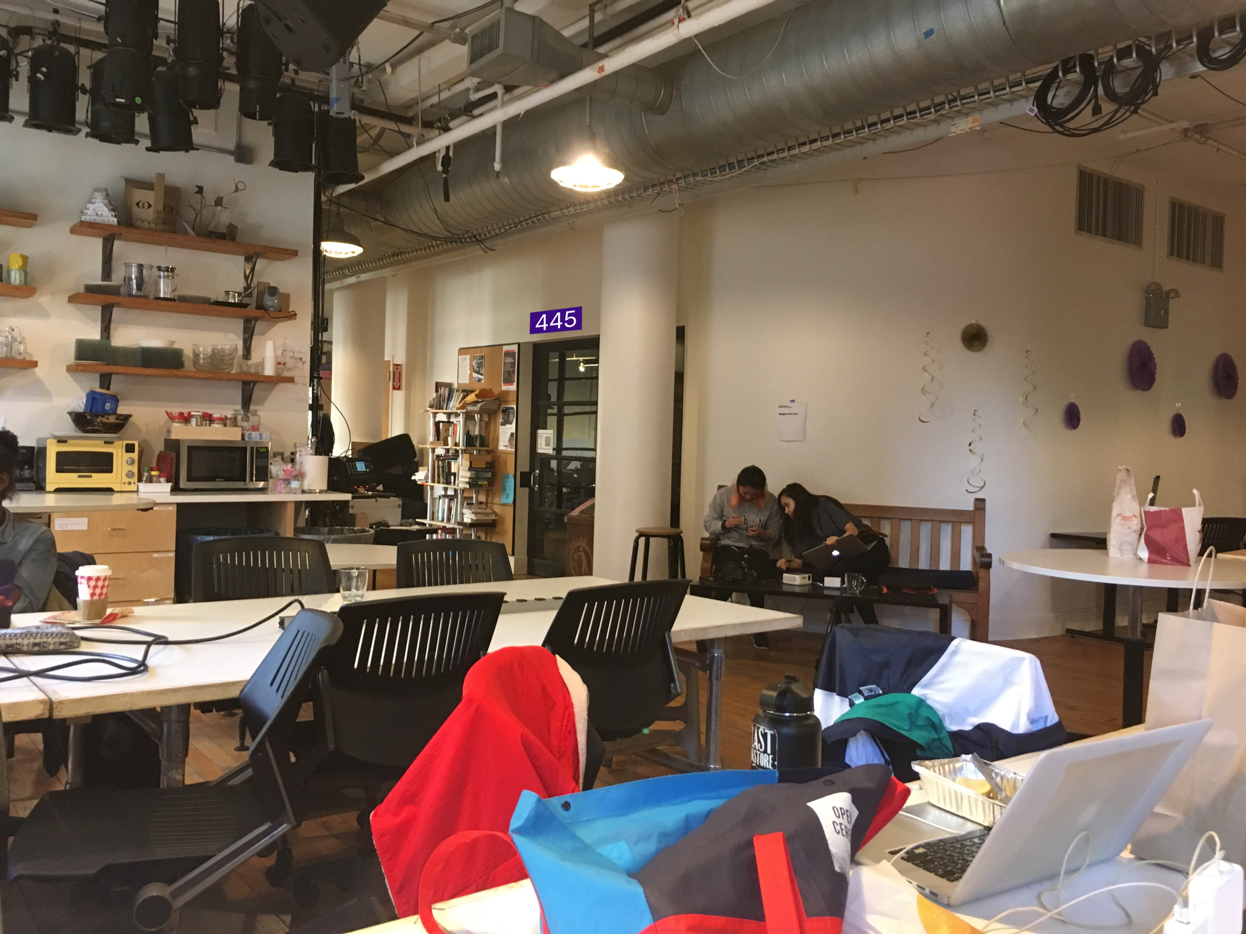
When I first got to ITP, I was inundated with new information. One of the more frustrating in the early days was navigating my commute through Brooklyn and Manhattan to get to my first classes. I was usually running late and once I finally reached ITP, out of breath, I found that the search was not over. No, I would have to encircle the whole of the floor to find my classroom for that period. This was the place where it all was supposed to make sense… Argh!!
One problem with the signs is visibility; you have to come within a 5 feet of them to read what the sign says. I would want the signs to be visible from much further away.
There are also up to three separate signs indicating the room number, of which there are two number systems in place - presumably one from NYU and one from ITP - with the addition of a descriptive reference, i.e. Classroom, Meeting Room A, Conference Room, etc. Oh, and if that’s not enough… there’s a QR code to boot! [facepalm]
So I propose that we get rid of the ITP reference names and nicknames altogether. The room numbers are the most useful for people who are unfamiliar with the floor who need to find their way as quickly as possible. Nicknames and references will be learned over time anyhow, so why try to put these on people at the outset? For this reason, I would use the number system originally overlaid by NYU, which has three numbers in a 4XX pattern, the 4 being for the 4th floor. Users may have found these numbers elsewhere on the NYU website. When people come from outside the ITP family, they may have been directed to a room number from a different NYU source.
Below is a side by side comparison with the old sign(s) and my proposed sign. I especially like the new proposal because it’s visible from afar which lets one find their way more efficiently.
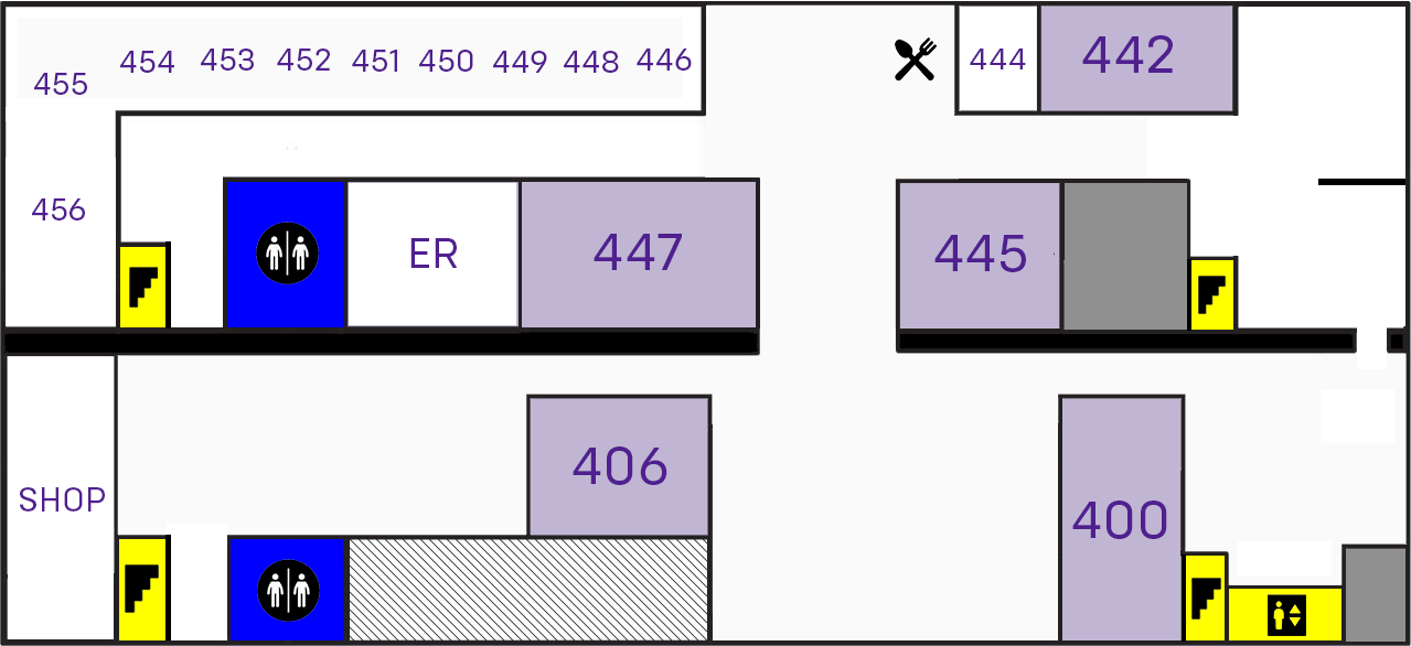
Going further, I would also change the online floor map to be simpler with less colors and substitute symbols where possible. I would again eliminate the colloquialisms and keep the information as simple as possible. There is also a mobile-friendly landscape layout. I would also propose some guide post signs with arrows with a multiple of rooms to be put on the wall at strategic locations, such as the corners and beginnings of hallways.
Below is the old floor map and then my new one with both orientations.
Old floor map: too cluttered, too many colors.
New floor map with symbols and clear color schemes.
New floor map in portrait orientation for mobile.
The other sign I found was of my favorite stores - One Of A Find vintage in Brooklyn. I believe we will revisit logo design later in the semester, but this has always bugged the hell out of me. As soon as I showed it to a classmate, they were like “Lola Find??” Whoever designed this logo broke a pretty basic design “rule” by using a different font for each letter in the name as well as adding a number!
The designer was most likely trying to communicate the uniqueness of the store’s wares, but the result is manic and very confusing.
The name of the store is a problem in itself. I love a good pun as much as the next joker, but the alliteration in the F and V sounds in “of” and “find” is really quite awkward to say. Alas, if the name is to stay the same, the logo should be redesigned, keeping the concerns of the client in mine. We’ll see what I can do with it later in the semester.


