
Vinyl album covers have always resonated with me because of their size, more so than say CD or cassette tape artwork. The size is engaging but still consumable, although at perhaps the a maximal size, and there is something pleasing taking place as film is blown up to this larger 12.375” format.


Upon a recommendation from a friend, I took a trip to Academy Records on W 18th St. I was there to check out album covers. I found a number of inspiring overs and began to pick some favorites. The series below has a very European cleanliness and modern retro appeal. There is a very scientific feel to the design which speaks to the nature of the music - synthesizer-based tunes which did require a quite a scientific mind to operate, especially in the early days of synthesis.


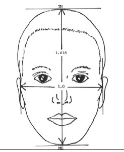
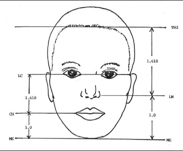
The records that I was drawn to the most though had a certain balance in common that wasn’t a straight 1:1 symmetry, but in thirds - 1:2:3 or 2:3:4 ratio. I have long been fascinated in sacred geometry and how the golden ratio might play into relationships, whether it be visual shapes or musical intervals. As an aside, I looked at some musical intervals for reference. The musical interval that I found to correspond to the feeling of beauty I saw in these ratios was a Major 6th or M6, which has a ratio of 1:1.66 repeating. The Minor 6th (m6) interval is closer in number to the golden ratio, but this interval had a darker, negative quality that didn’t correspond to the beauty in the aesthetic I was seeing. Moreover, the Major 6th has tension while still being considered “Major” - uplifting, grounded yet searching, not at rest, but not tired either. All that to say, these musical and geometric correlations are not concrete, but more something I am searching for.
The image I found the most striking imagery and balance was the cover for the “All Kind Music” album by a NYC band named Georgia (a unintended coincidence, since I have strong ties to the state). Unfortunately, as can sometimes be the case, the music did not compel me in the same way as the album art. I usually go for music that is organic, melodic and perhaps sentimental, with some exceptions made for the like of Jay Reatard, The Darkness, Outkast, or Daft Punk. Nonetheless, the imagery here was striking and illustrated this balance that I found pleasing.
Below we see the augmented symmetry of the grid - offset in thirds while still maintaining a perceived balance. One way this is achieved is balancing the larger spaces with less action.
The colors I found myself most drawn to at this moment are a mixture of pastel pink and green or aqua blue. The muted tones give a pleasing warmth and glow, without being overwhelming and drawing an understated attention to themselves.
More examples below. The type face or font (what’s the difference?) on the picture immediately beneath is that faux typewriter style which I don’t care for, although it does fit this artwork well enough. There are some more examples below of layout that I was drawn to.
Two font styles were used here: Rotis Serif Italic on the left and an unidentified font on the right which has an interesting mixture of sans serif and serif text, as exhibited in the “m” and “d” letters, used to good effect.